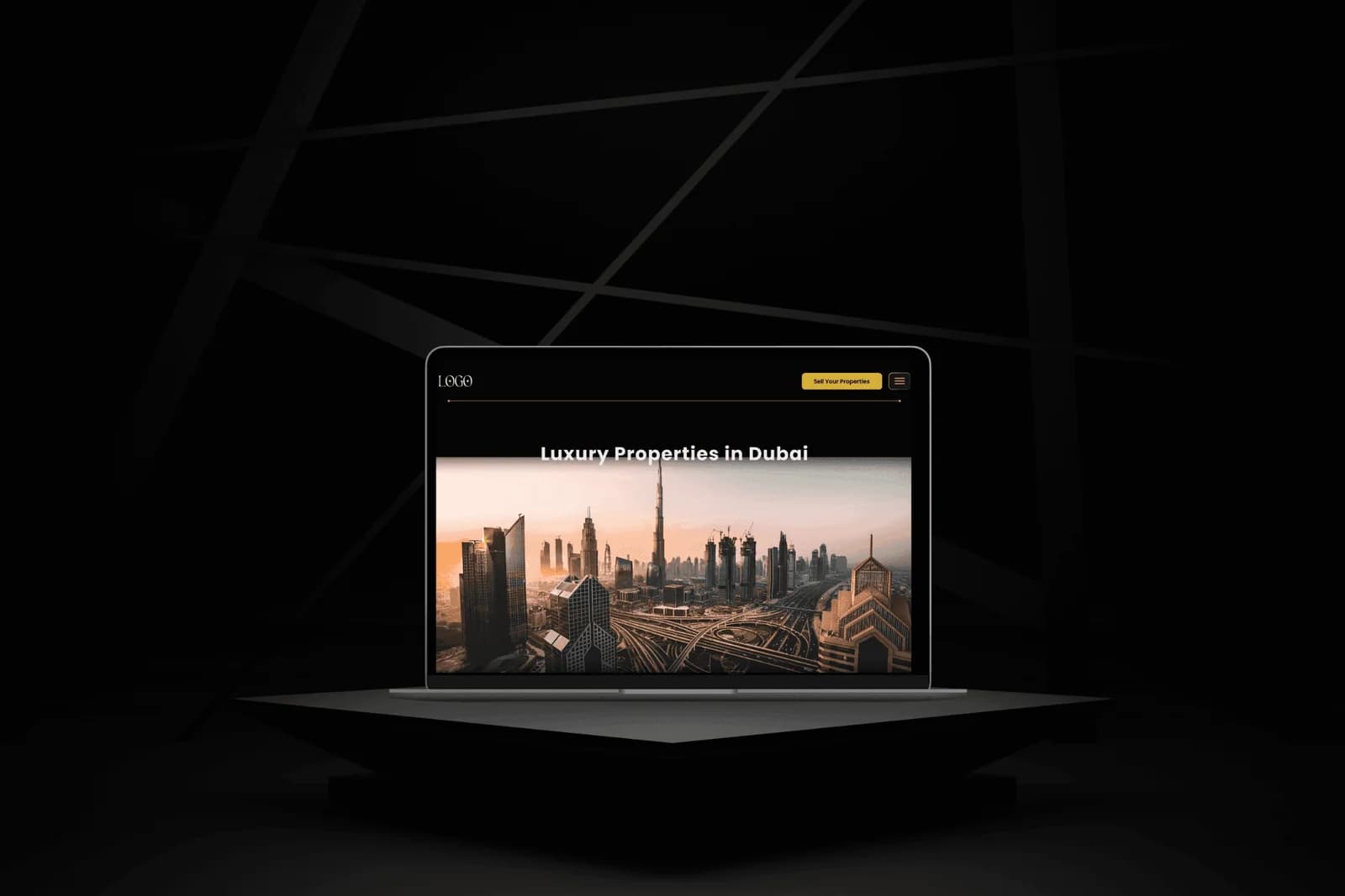
A 30-screen real estate web platform that reads like a publication that happens to sell property.
- The Problem
Chrome over content
Real estate sites layer bright chrome over their photography: thumbnails compete with forms, filters, and CTAs, and buyers spend more time scanning interface than looking at the property they came for.
- The Move
One signal color, one library
Inverted the pattern. Dark editorial base with a single signal color (yellow), and one component library that serves three audiences (buyer, seller, agent) under the same navigation logic.
- The Mechanism
Library before screens
Built the component library before any high-fidelity screen, so all 30 later decisions inherited real components with real states. Yellow carries every CTA, badge, and key data point.
- The Outcome
30 screens shipped solo in 1.5 months
Delivered as a build spec, not a screen library: named design tokens, auto-layout on every responsive element, hover / active / disabled variants on every interactive surface.
A dark editorial base gives every property image the whole stage instead of asking it to compete with a white background. The cost is a look that will feel unfamiliar to a first-time buyer, accepted so the photography can actually do its job.
Calls-to-action, agent badges, and key data points all carry the same yellow accent, so the brand is recognizable in one color rather than in decoration. This concentrates attention where it matters and removes the temptation to add color for its own sake.
The component library was built before any high-fidelity screen so every later decision inherited real components with real states. The trade-off is a slower start; the payoff is a handoff where the developer inherits consistent atomic vocabulary rather than 30 one-off layouts.
- Figma30 screens, component library, design tokens, and dev handoff
Need a product problem solved?