Redesigning Bykea’s ride-booking flow so it asks for one decision at a time instead of five at once.
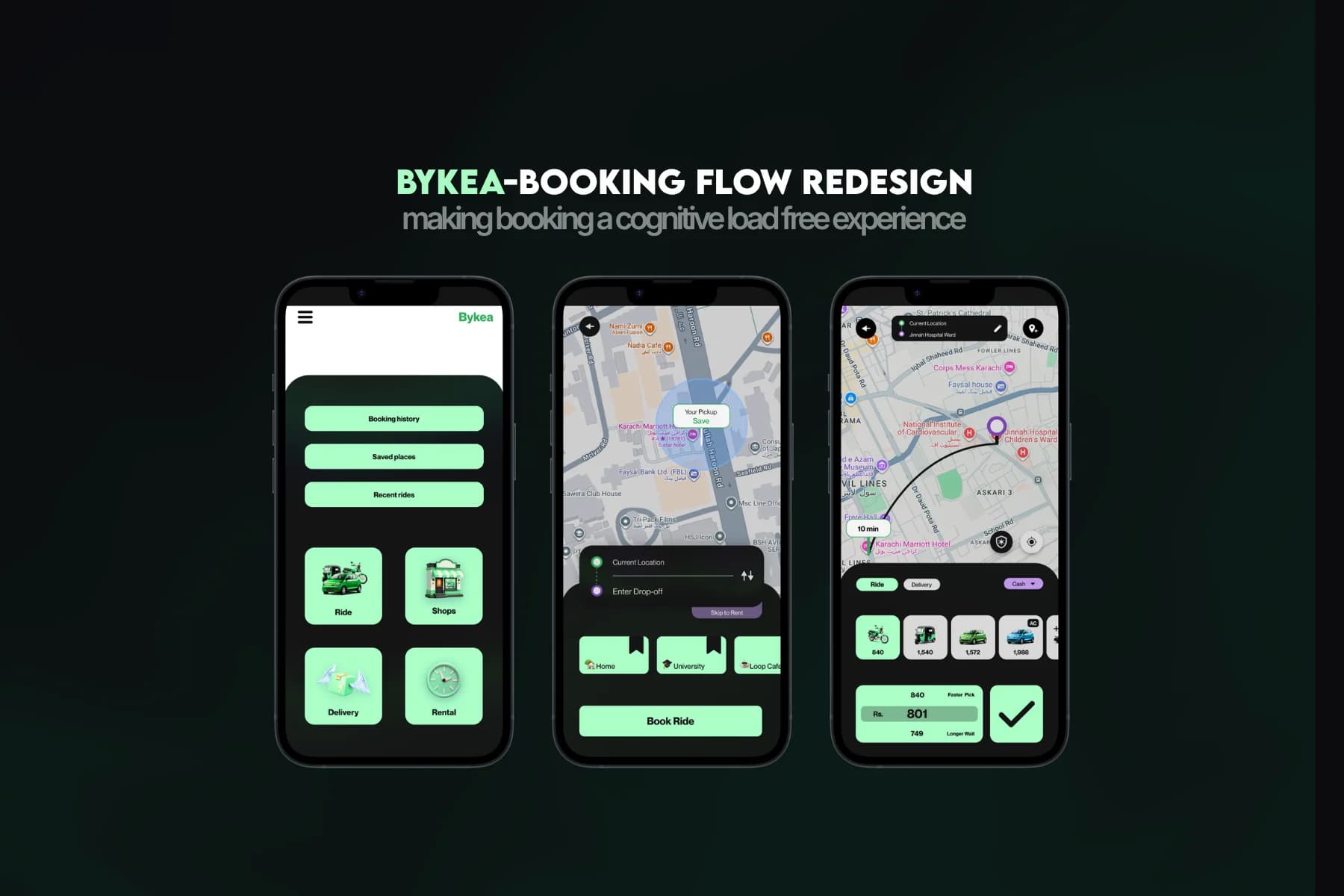
- The Problem
Six decisions on one screen
Bykea's home screen asked riders for pickup, destination, vehicle, price, payment, and confirm all at once, forcing six decisions before a single tap of progress. New users stalled before they started.
- The Move
One decision per screen
Traded one dense screen for a sequence of three simple ones. Every screen resolves exactly one decision, in the order a rider actually makes it.
- The Mechanism
Auto-fill + frequent places
Pickup auto-fills from GPS. Home and Work surface at one tap for frequent destinations. Vehicle and price get their own screens instead of competing for the same real estate.
- The Outcome
PKR 876M-1.75B modeled uplift
5-10% booking-completion lift against Bykea's PKR 18.40B-19.27B annual revenue base translates to PKR 876M-1.75B in illustrative additional revenue. Illustrative, not measured.
Pickup location fills in automatically from the phone’s GPS, the same way every other app already works. The trade-off is a rare case where the location is slightly off, against removing a needless extra tap for nearly every other ride.
Home, work, and a handful of regular spots surface for a single tap instead of a fresh address search every time. This only helps repeat trips, not first-time addresses, but most bookings are repeat trips, so it is a bet worth making.
The original flow crammed six decisions onto one screen to save taps. The redesign trades that for three simpler screens: more screens to move through, but each one only asks for what matters at that moment, so riders stop stalling before they even start.
- FigmaEvery screen and the design system, hand-built solo
- MobbinPattern reference for ride-hailing app flows
- DribbbleVisual reference for card and dark-mode palettes
Need a product problem solved?